Understanding the visual email builder
Last updated: April 11, 2025
Overview
Use the visual email builder to create beautiful emails with no coding required.
Read on to learn about the visual email builder.
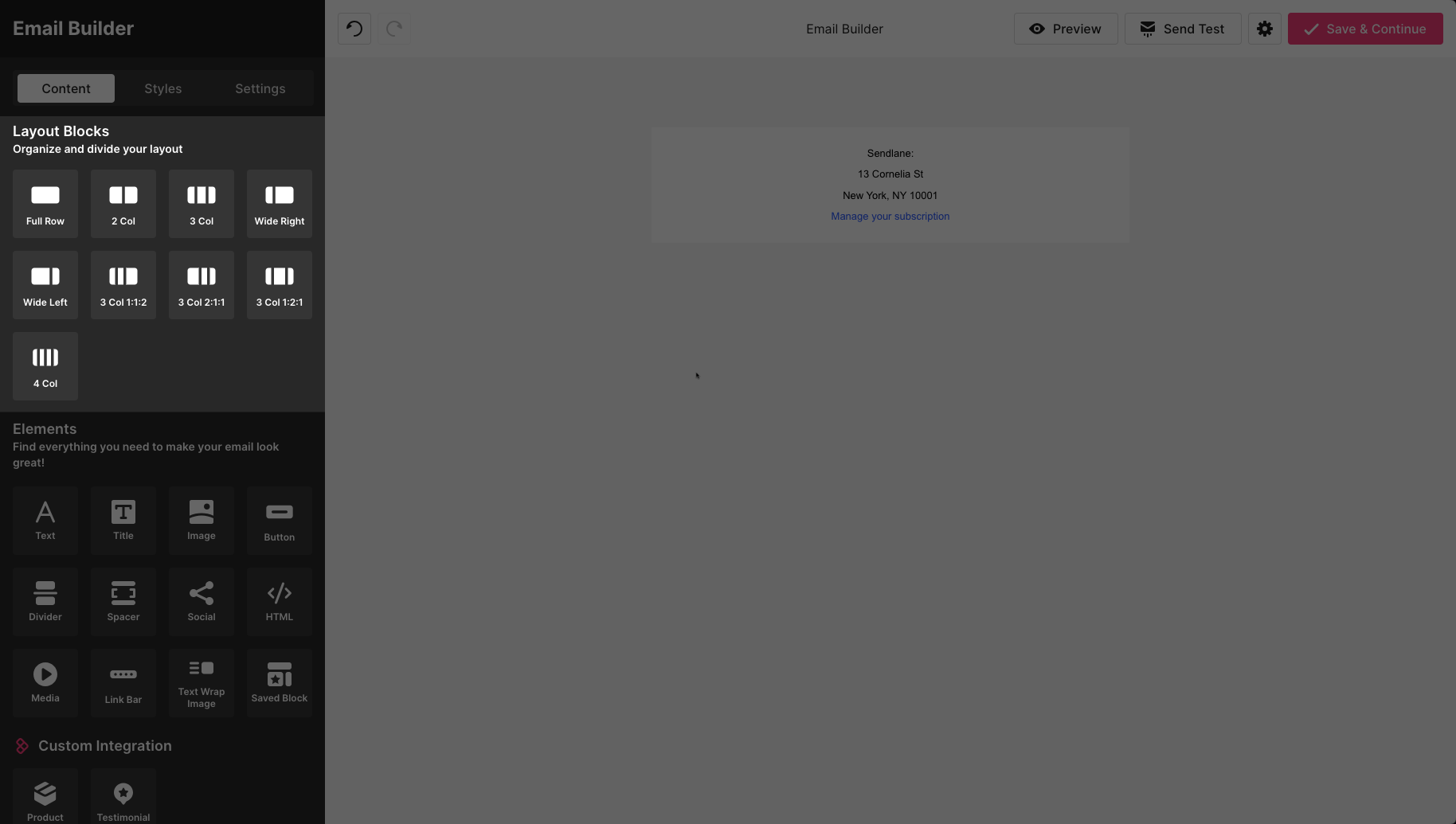
Layout blocks

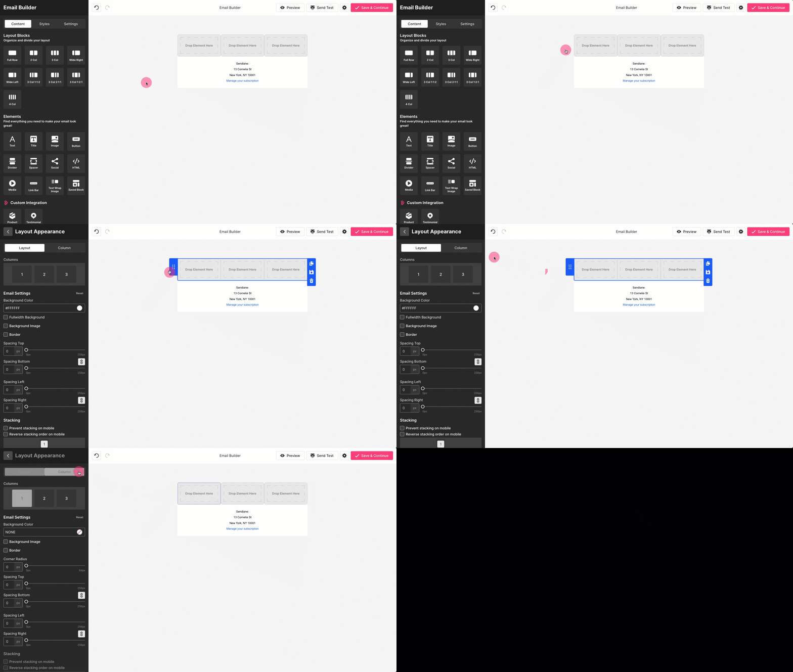
Layout blocks are containers for your email's content; they allow you to arrange elements in columns of various sizes. Click on or drag a layout block to add it to your email.
You can save layouts as saved blocks to use the same content across multiple emails.
Layout block settings
Click into a layout or just to the left of the layout to edit a layout's settings and settings for the layout's individual columns:

Background color
Change a layout block's background color
Fullwidth Background
Check this box to apply a background to the entire width of the email for the selected layout block
Background image
Check this box to use an image of 10MB or less instead of a solid color for the layout block's background. Accepted file types: JPG, JPEG, PNG, GIF
Background image size options:
Cover - Image is cropped horizontally or vertically based on the shortest side to fill the layout element
Contain - Image is scaled as large as possible within the layout block without cropping or stretching
Auto - Image's proportions are maintained and the image is scaled to fit the layout block
Background position - Select the background image's position inside the layout block
Background Repeat
Repeat Y - Image repeats on the Y axisRepeat X - Image repeats on the X axis
Border
Check the border box to apply a border to a layout block
Border Color - Change the layout block's border's color
Border Style - Select a solid or dashed line
Border Width - Select a border width from the dropdown or slider
Spacing Top/Bottom/Left/Right - Adjust spacing on any side of the layout block
Position - Select a position for the border
Stacking
Prevent stacking on mobile - Check this box to prevent layout blocks from being stacked when the email is viewed on a mobile device
Reverse stacking order on mobile - Check this box to reverse the order of blocks when the email is viewed on mobile
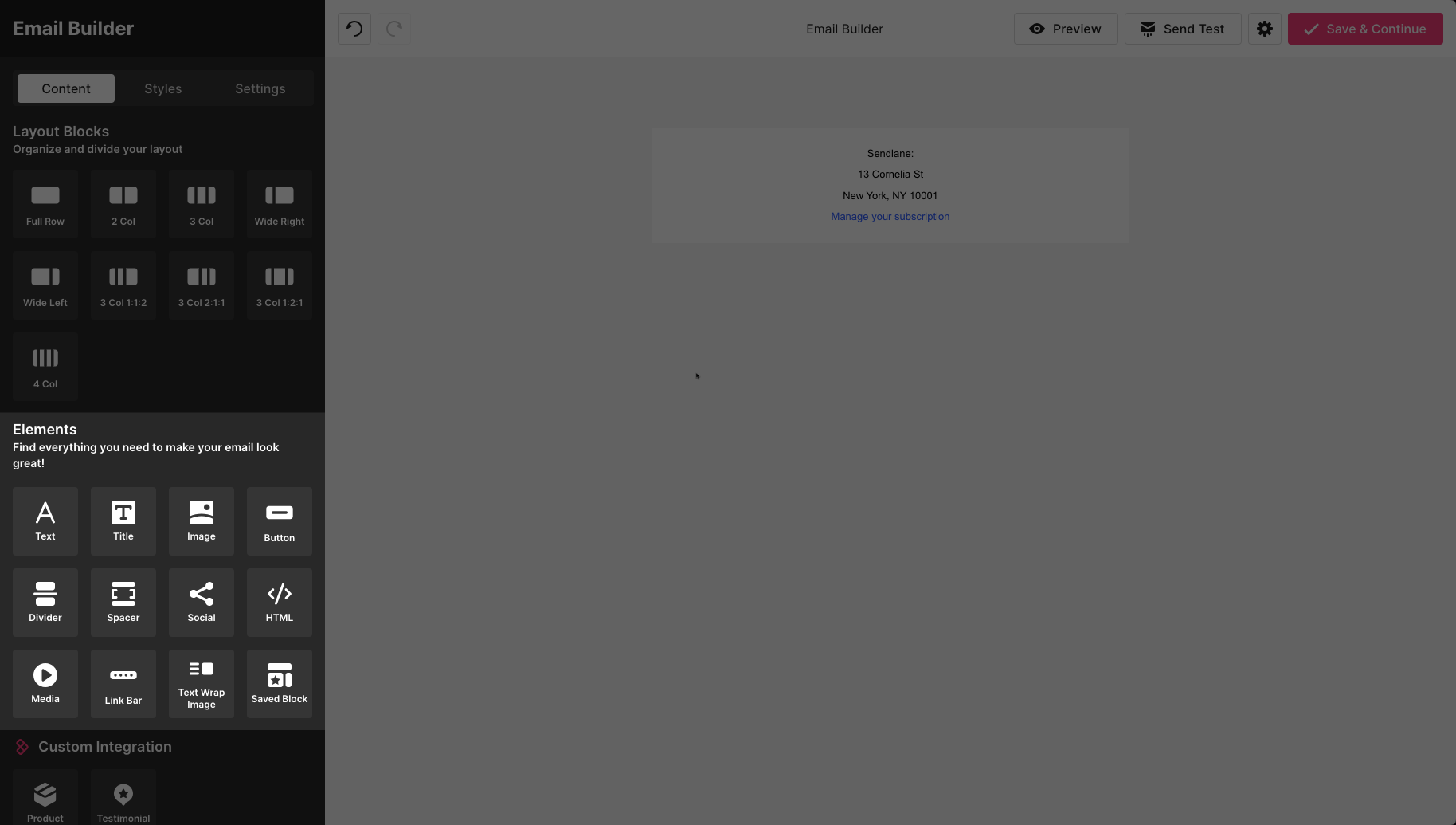
Standard elements

Standard elements are available in all emails created in the visual email builder.
Text
Best for copy and longer sections of text.
Adjust the text’s size, font family, color, alignment, line height, and letter spacing by clicking into the text element and highlighting the text you want to style.
Title
Best for titles, headers, or short sections of text.
Adjust the title’s size, font family, color, alignment, line height, letter spacing, and add hyperlinks, text styling or emojis by clicking the into title element and highlighting the text you want to style.
Image
Add static (JPEG, PNG, GIF, or WEBP files) or dynamic images (using templating syntax) to your emails.
Click on the image element to add alt text and adjust alignment, size, and corner radius.
Images can be made clickable by pasting a link in the link field. Select or create a new tag from the Tag dropdown to add a tag to contacts who click the image.
Button
Create a clickable button with custom text and styling.
Select or create a new tag from the Tag dropdown to add a tag to contacts who click the button.
Divider
Insert a divider line with custom styling to separate content sections.
Spacer
Insert a spacer to separate content sections without a visible line.
Social
Insert links to your company’s social media profiles.
Adjust the styling and social media icons and links by clicking the social element.
HTML
Insert custom HTML and CSS (<style> tags and inline styles only)
Media
Insert a link to a YouTube or Vimeo video to create a clickable image of the video’s thumbnail.
Adjust the video’s alt text, spacing, and button styles by clicking the media element.
Link Bar
Insert a bar with links to any URL.
Add, rearrange, and style the link bar by clicking on the link bar element.
Text Wrap Image
Insert a combination text and image element to wrap text around an image.
Adjust all text and image settings by clicking on the text wrap image element.
Saved Block
Use saved blocks to create common layouts like signatures, headers, or logos without creating them individually for each email. Learn more in How to create and manage saved blocks.
Dynamic elements
Some elements require specific data from the automation trigger to be enabled in the visual email builder. See the table below for information on where dynamic blocks are enabled.
Block appears in... | Product | Testimonial | Review | Abandoned Cart | Price drop |
All automations and campaigns when Shopify, BigCommerce, or custom eCommerce integration is connected | ✅ | ||||
All automations and campaigns when reviews is set up | ✅ | ||||
Automations triggered by review request | ✅ | ||||
Automations triggered by browse abandon, abandoned cart, or abandoned checkout | ✅ | ||||
Automations triggered by the price drop trigger | ✅ |
Product element
The product element allows you to display your store's products in emails. See How to display products in an email for details on the product block.
Testimonial
The testimonial block allows you to display customer submitted review of specified products. See How to insert reviews into emails for details on the testimonial block.
Review
The review block allows you to request reviews from contacts after they've made a purchase in your store. See How to request reviews with automations for details on the review block.
Abandoned cart
The abandoned cart block allows you to display products in abandoned browse, abandoned cart, and abandoned checkout automations. See the article for your desired automation for details on the abandoned cart block:
Price drop
The price drop block allows you to display products with discounted prices in emails in automations using the price drop trigger. See How to set up a price drop automation for Shopify for more details about the price drop block.
Add content to an email
To add content to your email, first add your layout, then add elements to your layout blocks.
Use elements like spacers and dividers to break up your layouts.
Global email style
Use the styles tab to set default global styling for links, buttons, headings, and body text. You can override these styles in individual element blocks.
Click the eye icon to slide out a preview of your selections.
Email settings
Use the email settings tab to set a background color or image, add a border, and specify spacing for your entire email.
Background Color - Select a background color for your entire email
Background Image - Select the checkbox to use an uploaded file as a background image and choose the image's position setting
Border - Select the checkbox to add and style a border for your entire email, including dashed or solid borders
Spacing - Adjust the spacing on all sides of your email
Email template settings
Click the gear icon in the top right to access template settings:
Save as new template - Save this email as a new template that will appear in the custom tab of the template page
Change Template - Replace the entire email you're working on with a pre-designed template from the Sendlane template library
Clear Template - Remove all content from your email and start from scratch
Troubleshooting
My text's formatting looks odd or isn't updating correctly when I adjust its color, size, or font!
If you pasted text from another application into the email builder, the text may be attempting to retain its formatting from the previous application.
If your text looks off, you can remove all of its formatting by selecting the text and clicking the remove formatting button: