Understanding form design and customization options
Last updated: July 15, 2025
Overview
You can customize your forms’ device display options, add multiple pages to your form, and style every part of your form to seamlessly blend in with the rest of your website.
Read on to learn about options for designing and customizing your Sendlane Forms!
Check out our guide to using custom CSS with forms here
New form options
When you create a new form, you’re asked to set your form’s name, type, device type, and layout:
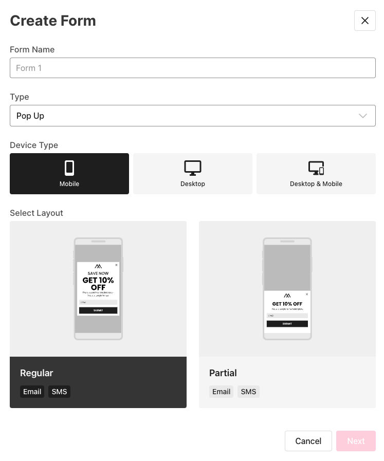
Form name - The name of your form will only be seen inside Sendlane and will never be visible on your website. Enter a descriptive name for your form.
Type
Pop Up - form that sits on top of your website content (can be full screen)
Inline - form that is embedded into your website’s content
Device Type
Mobile - display your form only on mobile devices
Desktop - display your form only on desktop
Desktop & Mobile - display your form on both mobile and desktop devices.
Layout
Regular - display your form in the middle of the screen
Partial - display your form in the bottom portion of the screen
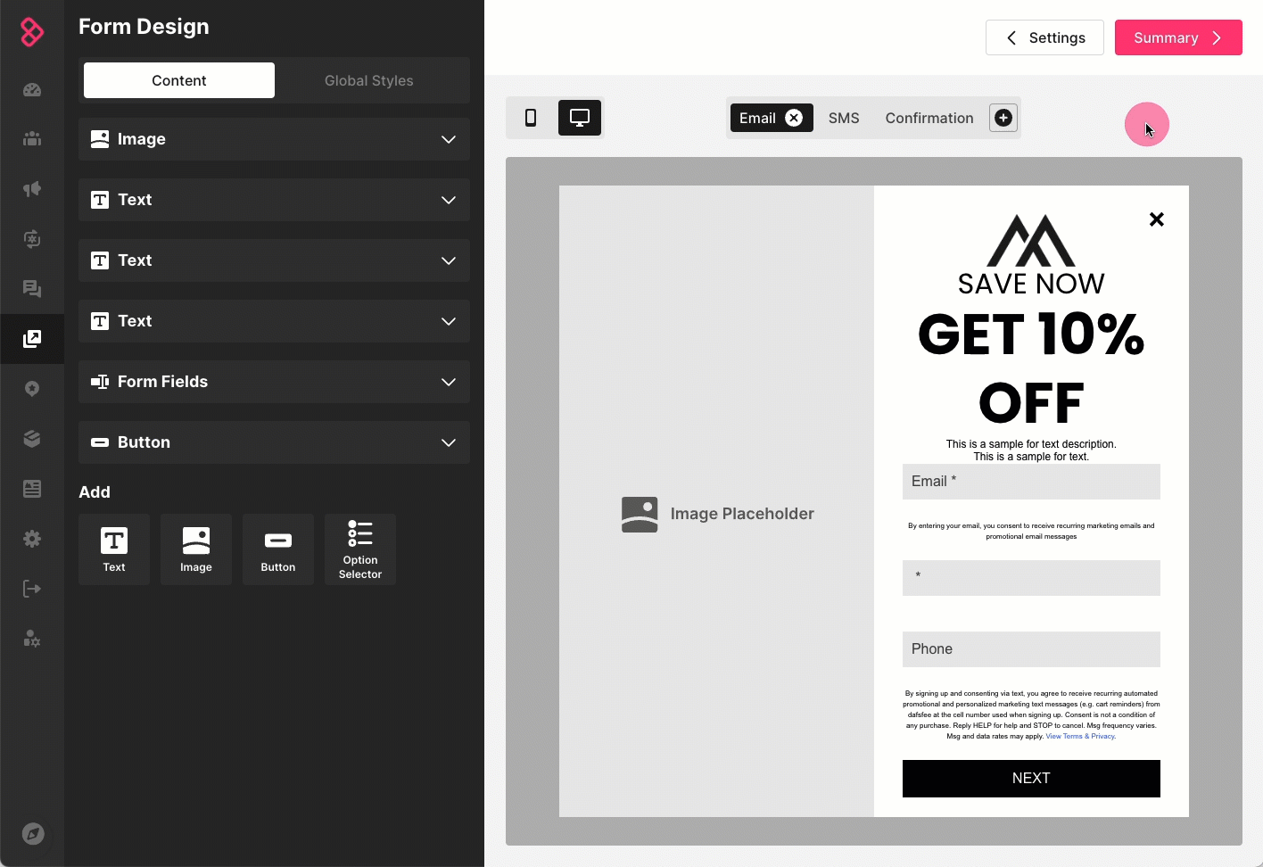
Add and rearrange form pages
Add or rearrange your form’s pages on the design screen of the form builder.
To add a new page to your form:
Click the plus button at the top of the form preview
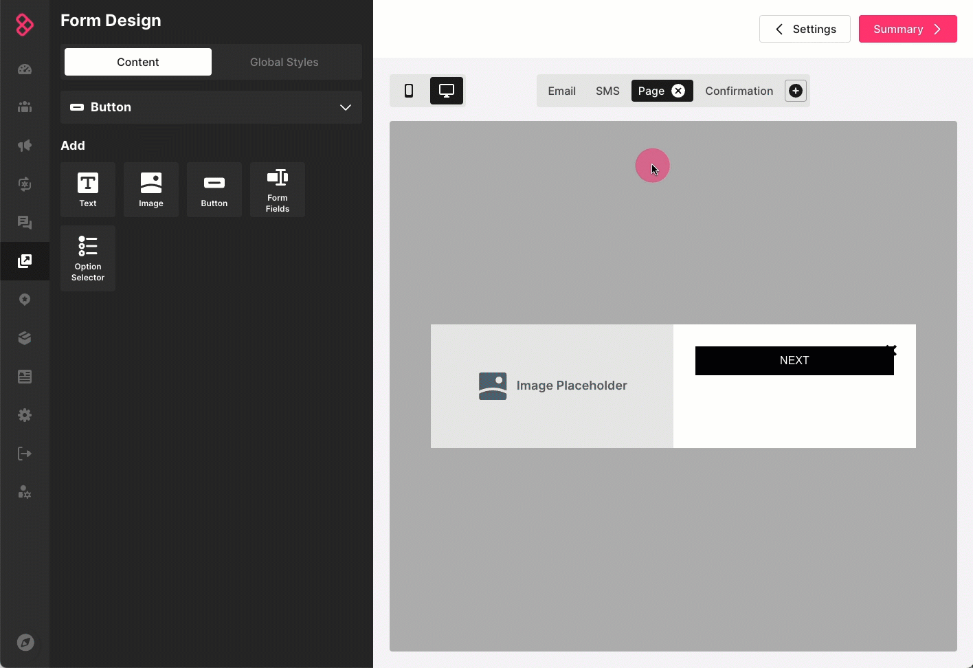
Select a page type
Blank page - a page with no default fields except a “next” button
Email - a page with a required email field
SMS - a page with a required phone number field
Enter a descriptive name for your page
Click Add Page
To rearrange your form’s pages:
Click and hold the page you want to move
Drag it into the position you want
Let go of the page
Set global form styles
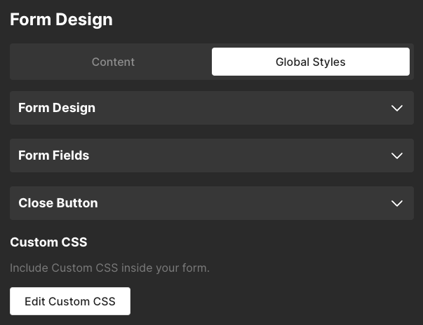
Use the Global Styles tab of the Form Design screen to set your form's design, global styles for form fields, and to set your form's close button styling.
Global Form Design Styles
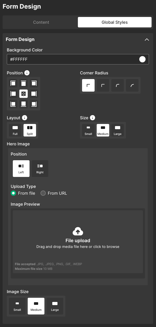
Layout - Select Split to add a left or right justified hero image to the default Full form, then select an image from a file or URL (this option should only be used for desktop forms; the form's text will render incorrectly on mobile if split layout is enabled)
Split layout options:
Position - Select to display the hero image on the right or left side of your form
Image Size - Select a size for your hero image
Small - Image fills 30% of the form
Medium - Image fills 50% of the form
Large - Image fills 70% of the form
Background - Select whether to use a color or an image for your form's background
Color - Select a preset color or enter a hex value for your form’s background color
Image
Upload type - Select From file to upload an image from your desktop or From URL to use an image's URL
Background size - Select one of the following CSS based background size options
Cover - Retains the image's aspect ratio while scaling the image to the smallest size required to fill the form background
Contain - Retains the image's aspect ratio while scaling the image as large as possible without cropping or stretching
Auto - Retains the image's original dimensions
Px - Use the slider to set the image's static width
Background position - Select a position for the image
Background Repeat - Select Repeat Y to repeat the image on the Y axis (vertically), select Repeat X to repeat the image on the X axis (horizontally)
Fullscreen (Only for pop-up type forms with a regular layout) - Check the box to make your form take up the entire screen on desktop and mobile (pop-up type forms with a regular layout only)
Overlay Style - If Fullscreen is unchecked, you can select an optional overlay style that will fill the rest of the screen with a light, medium, or dark shade of gray. Custom colors are not available for overlays.
Corner Radius - If Fullscreen is unchecked, you can select a curved corner radius
Position - Select the position on your website the form should display in (available only for regular layout forms)
Corner radius - Select a corner radius for the form
Size - Select a size for the form (available only for desktop regular layout forms)
Global Form Fields Styles
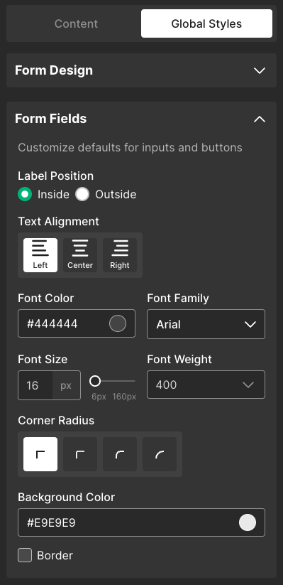
Label position
Inside - show the field label inside the field
Outside - show the field above the field
Text alignment - Select an alignment for form labels
Font color - Select a preset color or enter a hex value for your form labels’ font
Font family - Select a font family for form labels
Font size - Select a font size for form labels
Font weight - Select a font weight for form labels
Corner radius - Select a corner radius for form field boxes
Background color - Select a background color for form field boxes
Border - Check the checkbox to add a border to form fields, then select a color and thickness for the border
Close Button
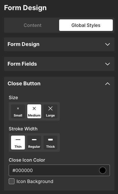
Size - Select a size for the close button
Stroke Width - select a width for the close button
Close icon color - Select a preset color or enter a hex value for your form’s close button
Icon background - Check the checkbox to select a background color for the form’s close button
Set styles for individual content blocks
Use the Content tab of the Form Design page to add and style to elements on your form:
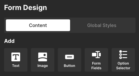
Image
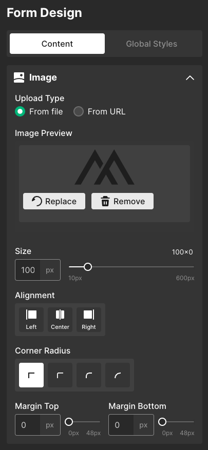
Upload Type - Select From file to upload an image file or From URL to paste an image URL into the form builder. Replace the placeholder image with an image of your own.
Size - Adjust the image’s size
Alignment - Select an alignment for the image
Corner Radius - Select a corner radius for the image
Margin Top - Adjust the image’s top margin
Margin Bottom - Adjust the image’s bottom margin
Text
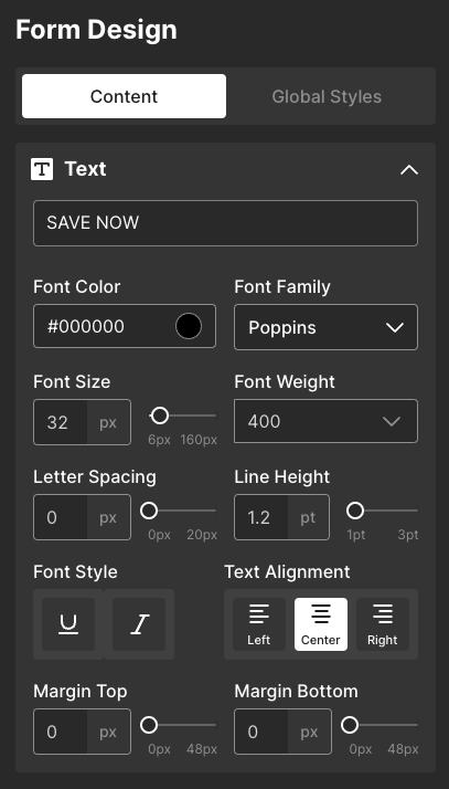
Text field - Enter text to display on your form
Font color - Select a preset color or enter a hex value for your text element’s font
Font family - Select a font family for your text element
Font size - Select a font size for your text element
Font weight - Select a font weight for your text element
Letter spacing - Adjust the text element’s spacing between letters
Line Height - Adjust the text element’s line height
Font Style - Select U to underline text or I to italicize text
Text Alignment - Select an alignment for your text element
Margin Top - Adjust the text element’s top margin
Margin Bottom - Adjust the text element’s bottom margin
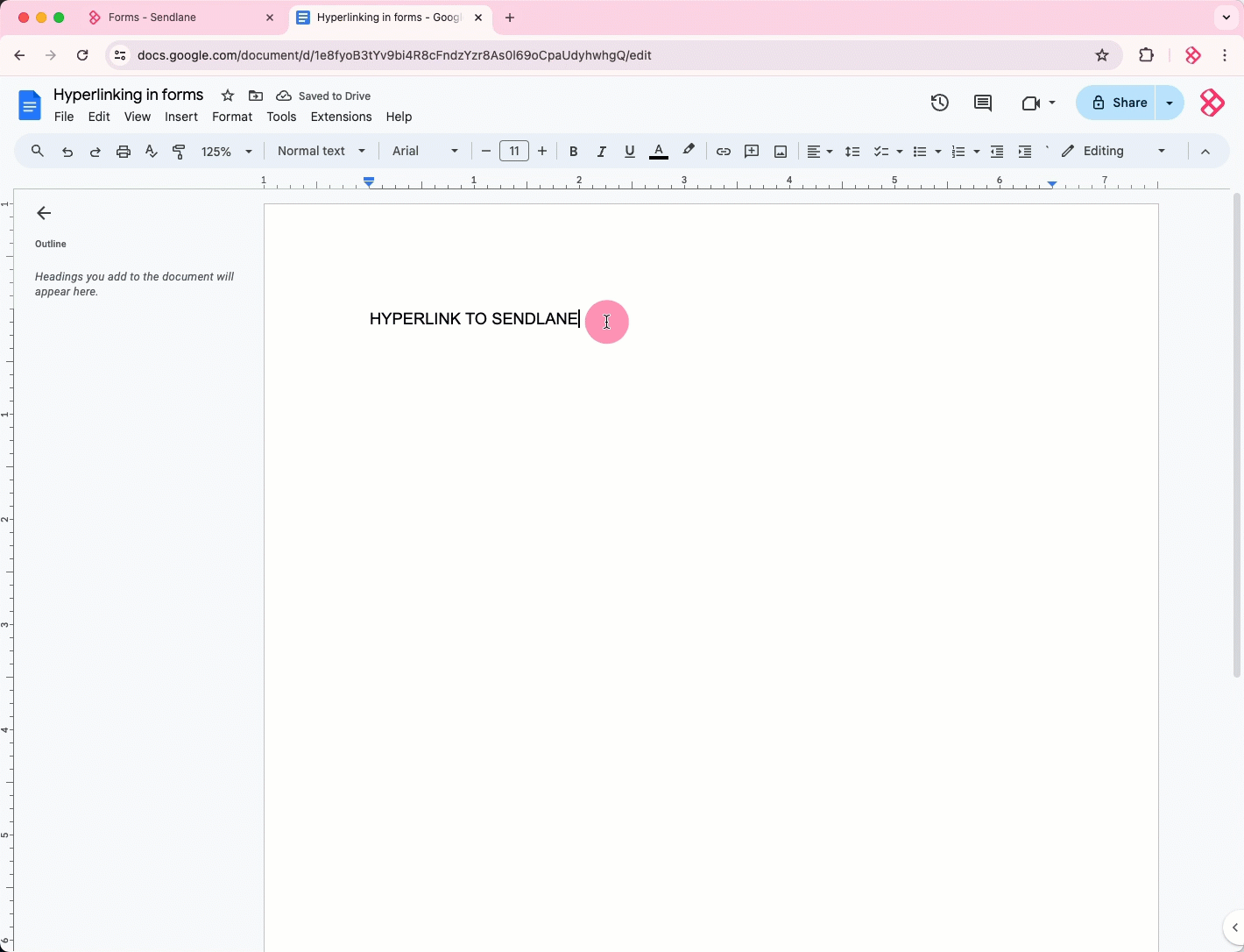
How do I add a hyperlink to a form?
You can paste hyperlinks created elsewhere, such as in a Google Doc or Notion page, into a text element. See the guide to using custom CSS with Sendlane Forms to learn how to change the color of links in your form.
To add a hyperlink to your form:
Open a Google Doc, Notion, or other software that allows you to create hyperlinks
Create your hyperlink
Copy your hyperlink
Paste the hyperlink into the text field
Form Fields
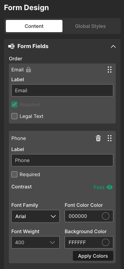
Order - Click and hold the drag and drop icon to rearrange form fields
Label - Change a field’s label text in the Label field
Required checkbox - Check the Required checkbox to mark the field as required for form submission
Legal Text - Click to add and edit legal text appended to email and SMS fields
First Name - Collect a Contact’s first name
Last Name - Collect a Contact’s last name
Custom - Select an existing custom field or create a new one to collect via your form
The Subscribe, Affiliate, Privacy Statement, and Email Consent fields should not be used. They will be removed from the form builder.
Option Selector
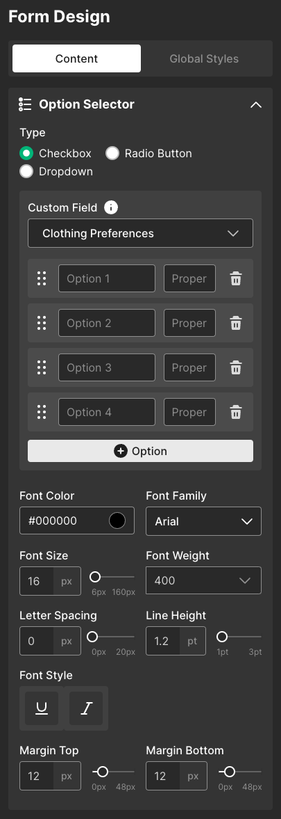
Type
Checkbox - Allow Contacts to select multiple options
Radio Button - Display all options and allow Contacts to select one only
Dropdown - Allow Contacts to select one option from a dropdown
Custom Field - Select an existing custom field or create a new one
Options
Use the drag and drop icon to rearrange options
Enter text to display on your form for the option in the Option field
Enter the text you want to collect in Contacts’ custom field data in the Property field
Click + Option to add another option
Font color - Select a preset color or enter a hex value for your options’ font
Font family - Select a font family for your options
Font size - Select a font size for your options
Font weight - Select a font weight for your options
Letter spacing - Adjust the options’ spacing between letters
Line Height - Adjust the text options’ line height
Font Style - Select U to underline text or I to italicize options
Margin Top - Adjust the options’ top margin
Margin Bottom - Adjust the options’ bottom margin
Button
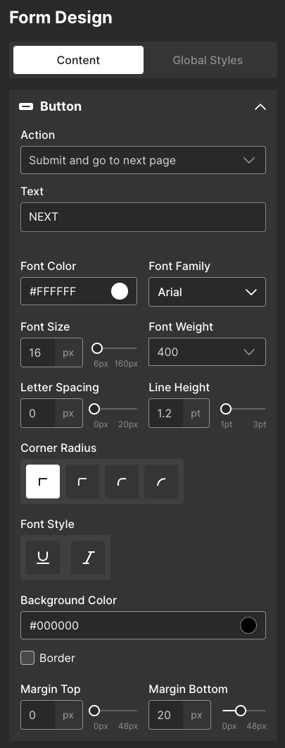
Action
Submit and go to next page - Submit data to Sendlane and go to the next page of the form
Submit and close form - Submit data to Sendlane and close form
Submit and go to URL - Submit data to Sendlane and go to a specified URL
Close Form - Dismiss the form (website visitors who dismiss the form will not see it again for three days)
Go to URL
Text - Enter text to display on the button
Font Color - Select a preset color or enter a hex value for your button’s font
Font Family - Select a font family for your button
Font Size - Select a font size for your button
Font Weight - Select a font weight for your button
Letter Spacing - Adjust the button’s spacing between letters
Line Height - Adjust the text button’s line height
Font Style - Select U to underline text or I to italicize button text
Margin Top - Adjust the button’s top margin
Margin Bottom - Adjust the button’s bottom margin
Corner Radius - Select a corner radius for form field boxes
Background Color - Select a background color for form field boxes
Border - Check the checkbox to add a border to form fields, then select a color and thickness for the border