Forms custom CSS guidance
Last updated: July 11, 2025
Overview
You can use custom CSS to design your Sendlane forms with even more granular control.
Read on to learn what's possible with CSS and Sendlane Forms!
How to add custom CSS to a Sendlane Form
To add custom CSS to a Sendlane Form:
On the form design page, click the Global Styles tab
Click Edit Custom CSS
Enter your custom CSS in the text box
Click Save
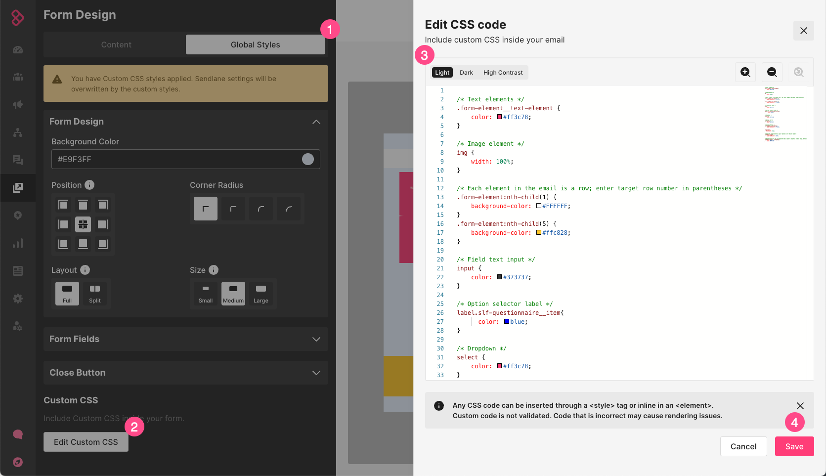
Available CSS selectors
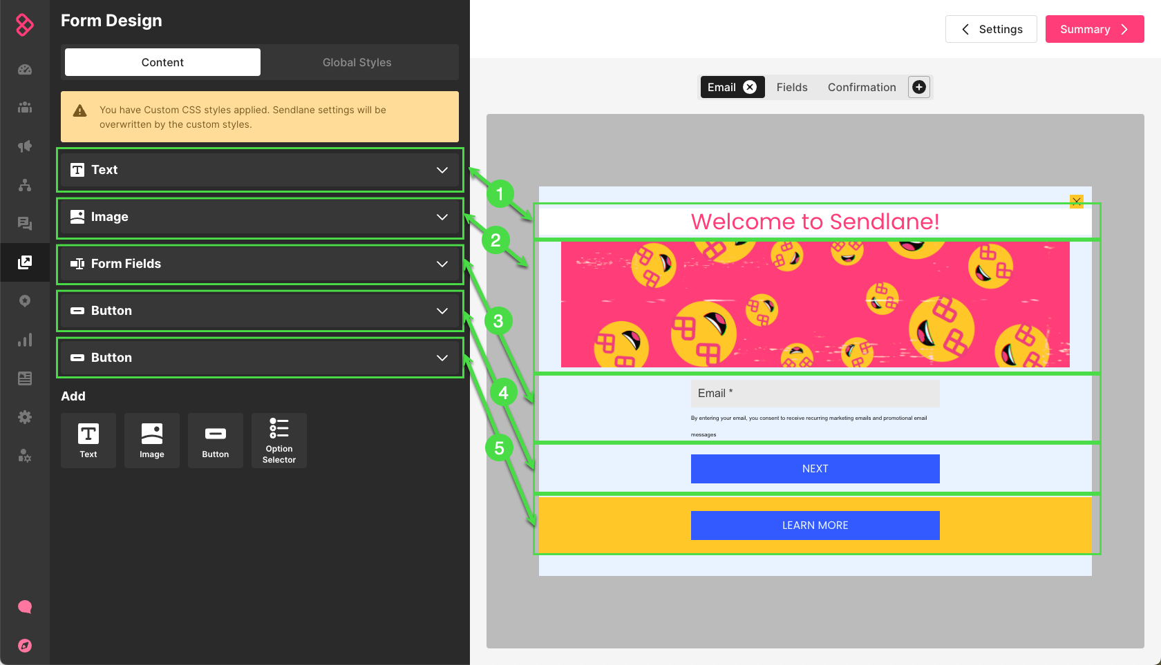
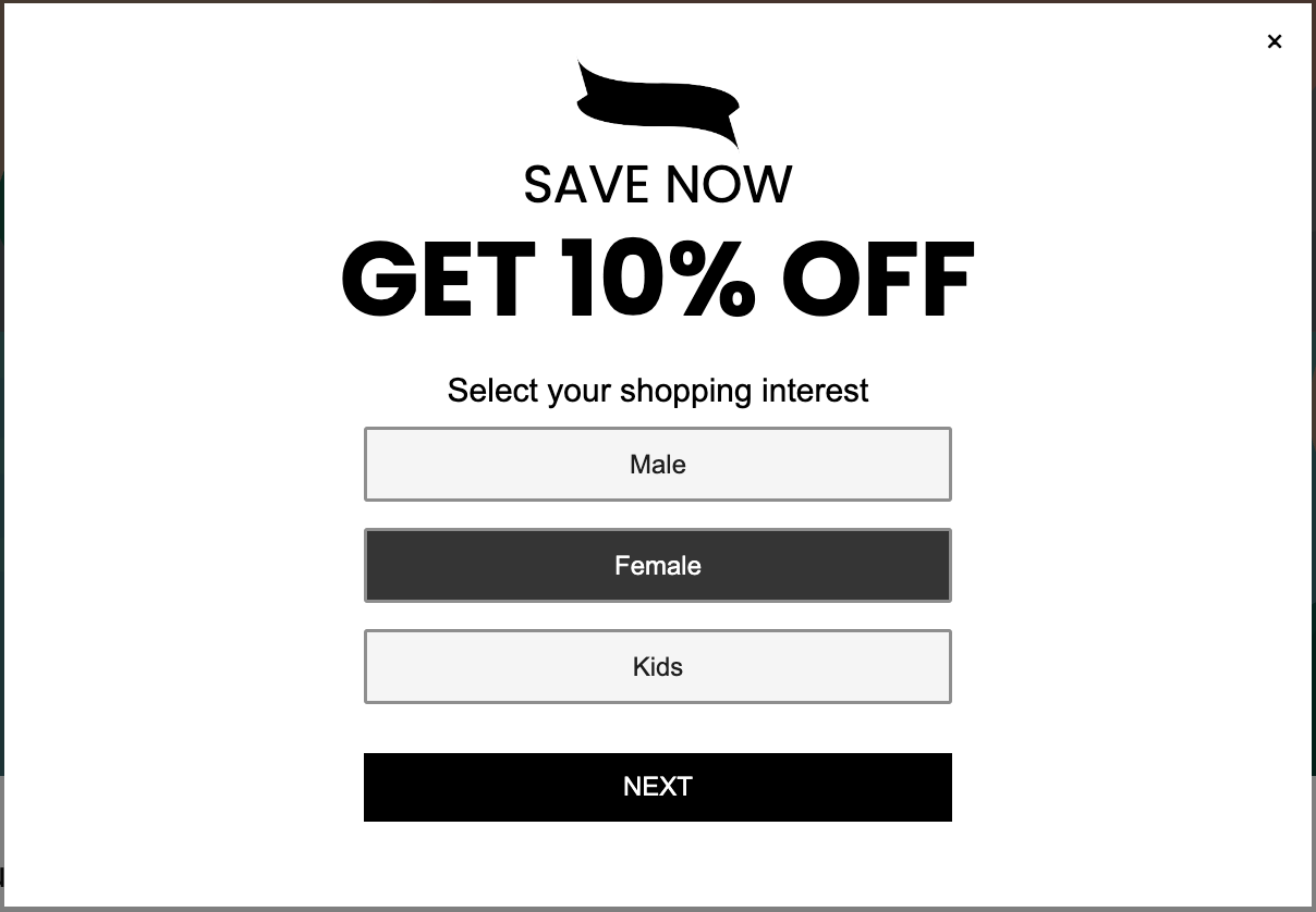
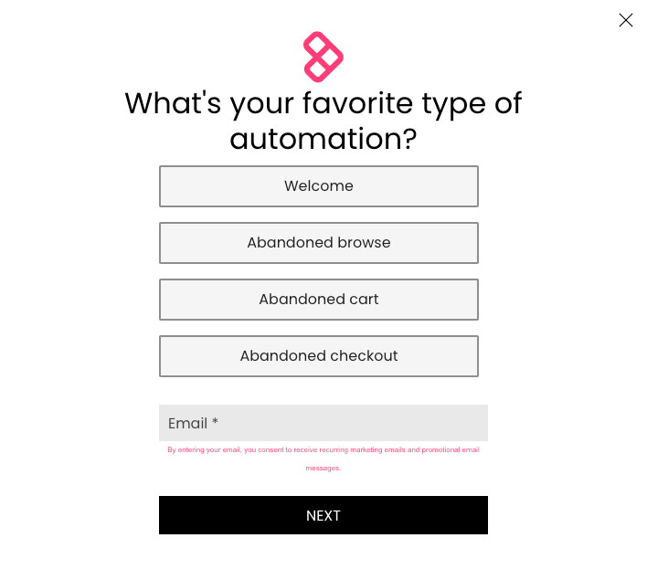
The CSS example below shows all available selectors for Sendlane forms. The screenshot below the CSS shows the effects of the sample CSS on a Sendlane form.
Use w3's CSS reference guide for information on styles to apply to your form. Then, try copying the snippet below into the custom CSS box of your own form and replacing the values to see how the CSS changes your form!
/* Text elements */
.form-element__text-element {
    color: #ff3c78;
}

/* Image elements */
img {
    width: 100%;
}

/* Each element in the email is a row; enter target row number in parentheses */
.form-element:nth-child(1) {
    background-color: #FFFFFF;
}
.form-element:nth-child(5) {
    background-color: #ffc828;
}

/* Field text input */
input {
    color: #373737;
}

/* Option selector label */
label.slf-questionnaire__item{
      color: blue;
}

/* Dropdown */
select {
    color: #ff3c78;
}

/* Button text */
.slf-button {
    color: #e9f3ff;
}

/* Close/x button */
.slf-widget__close-button {
    background-color: #ffc828;
}

.legal-text {
  line-height: 12px;
}

/* Class to target specific page; replace 1 with desired page */
.slf-form--page-2 {
    background-color: white;
}

/* Stack classes in one line separated by a space to target an element (e.g., button) on a specified page */
.slf-form--page-2 .slf-button {
    color: #ff3c78;
}
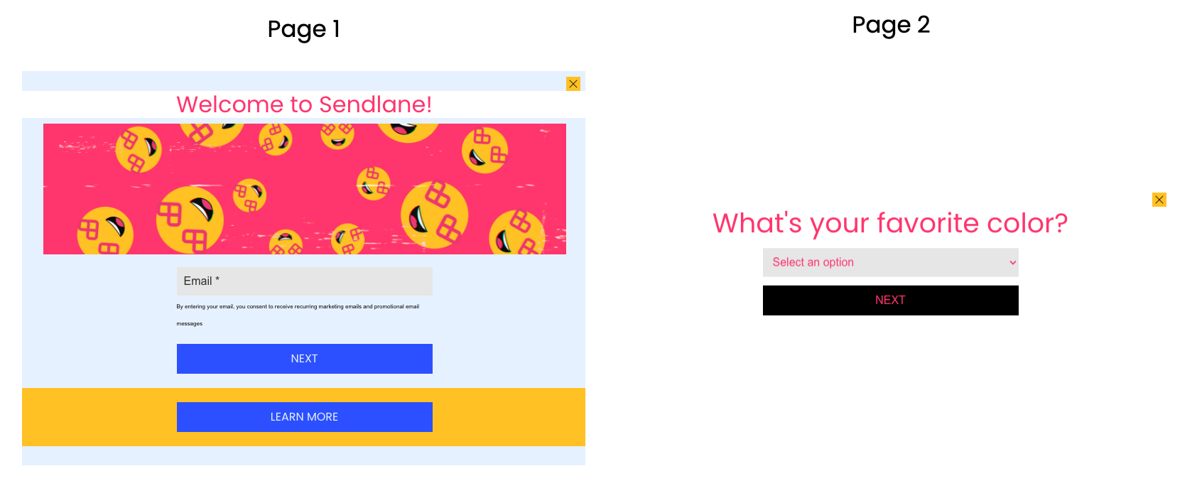
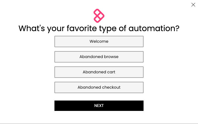
How to target a specific page
You can target a specific page of your form with custom CSS to apply a single style to one page only by using the .slf-form--page-1 class and replacing 1 with whichever page you want to target.
Let's say you want each page of your form to have a different background, like this:
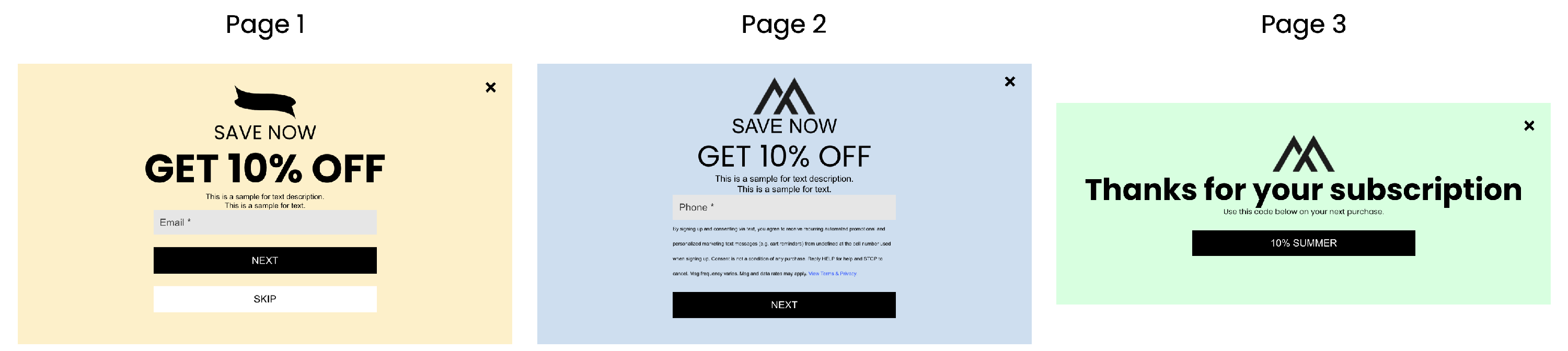
You can use the following snippet to achieve the yellow, blue, and green pages above by changing the background-color values to your preferred colors (see more information on adjusting backgrounds with CSS here):
.slf-form--page-1  {
    background-color:#FDF2D0;
}

.slf-form--page-2  {
    background-color: #D3E2F1;
}

.slf-form--page-3  {
    background-color: #DCFFE4;
}
How to target a specific element
You can use stacked classes to target a specified element on a specified page.
Use the .slf-form--page-[PAGE NUMBER] class to specify the form page (replace [PAGE NUMBER] with the number of the page you'd like to target), then add a space and an element selector, like .slf-button or another element listed above.
In the example below, only the button on the second page of the form is targeted:
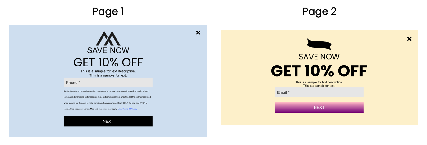
You can use the following snippet to single out an element by replacing [PAGE NUMBER] in .slf-form--page-[PAGE NUMBER] with the number of the page you'd like to target, add a space, then change .slf-button to the element selector you'd like to target:
.slf-form--page-2 .slf-button {
background-image: linear-gradient(pink, purple);
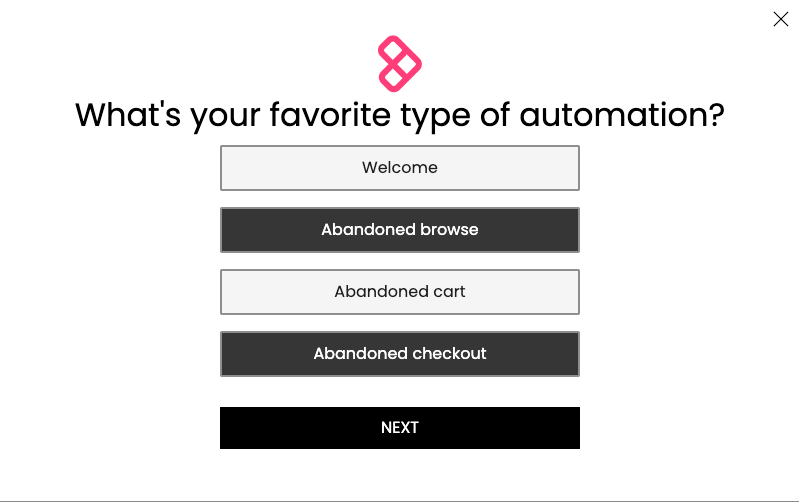
}How to target a specific position
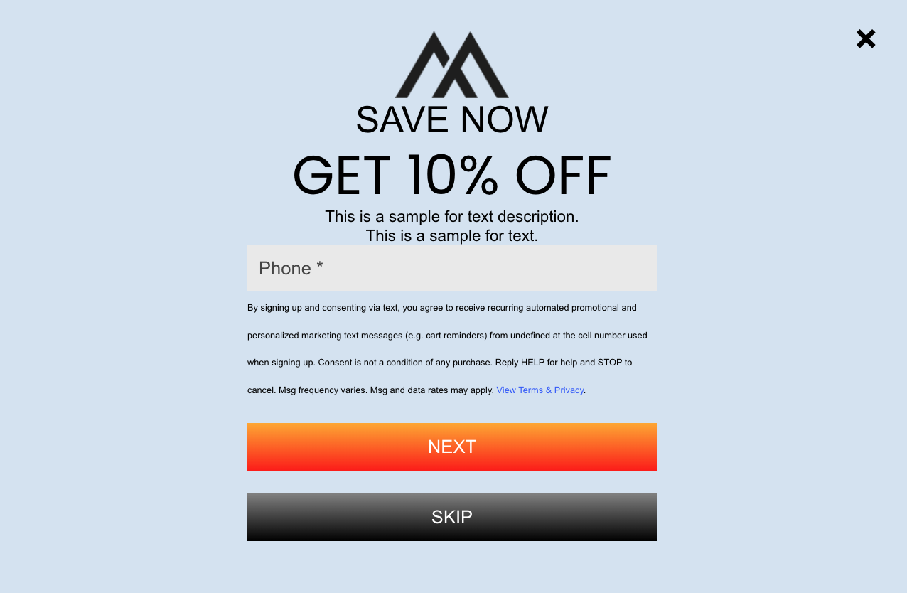
Targeting by position is helpful when you have two of the same elements on a page, like a button, and want to change the styling for just one. Each element in your form has a sequential position that starts at the top (the first element) and ends at the bottom (the last element). You can target elements using their position on your form instead of the element name.
To determine the position you want to target, count the elements in your form starting at the top:
You can target the position you want by adding a .form-element:nth-child(POSITION NUMBER) class before the element you want to change (replace POSITION NUMBER with a number).
The following snippet will make the second button in the form above green instead of blue:
.slf-form--page-1 .form-element:nth-child(5) .slf-button {
  background-color: green;
}
How to stack classes and target by multiple attributes
You can target multiple attributes by stacking classes from page > position > element. You must use that order whenever stacking classes and separate each class with one space.
The snippet below targets both buttons on page 2 of a form:
.slf-form--page-2 .form-element:nth-child(6) .slf-button {
  background-image: linear-gradient(orange, red);
}

.slf-form--page-2 .form-element:nth-child(7) .slf-button {
  background-image: linear-gradient(gray, black);
}
How to set fields in two columns on desktop
You can use the example code below to show your form's fields in two columns if viewed on desktop. Fields will be stacked into one column on mobile.
.form-element {
  display: grid;
  grid-template-columns: 1fr 1fr;
  gap: 20px;
  align-items: start;
  float: left;
  /* important: aligns all fields to the top */
}@media (max-width: 480px) {
  .form-element {
    display: block !important;
    grid-template-columns: 1fr;
  }  .slf-button {
    width: 100% !important;
    padding: 12px 64px !important;
  }
}.field-wrapper {
  margin-top: 0px !important;
  margin-bottom: 16px;
}.slf-button {
  width: auto !important;
  padding: 12px 48px;
}
How to apply a gradient to buttons
You can use gradients to create smooth transitions between two or more colors in your form buttons. See examples below:

.slf-button {
  background-image: linear-gradient(pink, purple);
}
.slf-button {
  background-image: linear-gradient(
    104deg,
    rgba(253, 81, 100, 1),
    rgba(36, 208, 235, 1)
  );
}
For more information on gradients, check out w3's guide to CSS gradients and experiment with your forms.
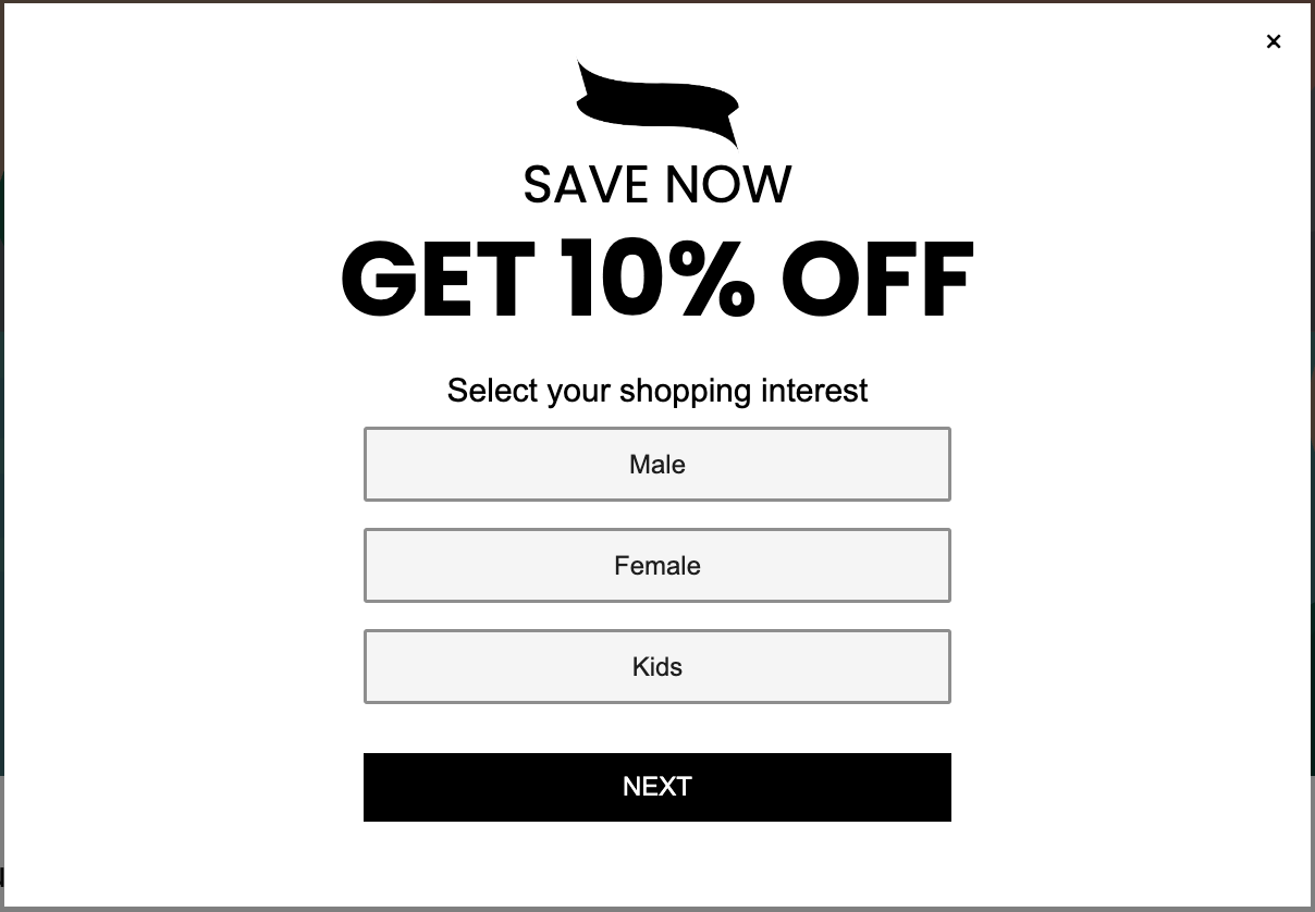
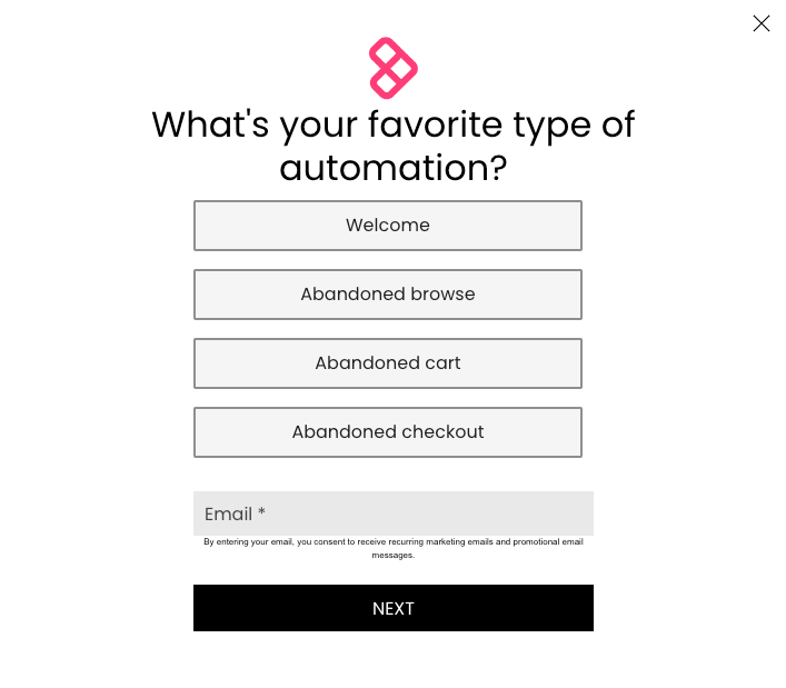
How to wrap option selector block selections
If you use an option selector block with many options, you may want to wrap your options so that they appear more compactly in your form and are easier to scan.
You can use and adjust the following snippet to turn your option selectors into "buttons" that are grouped together:

We suggest not editing the .slf-questionnaire section or checkbox squares unless you are familiar with CSS.
In the .slf-questionnaire__item section, Edit the border and background-color to match your brand's styling.
/* Make options wrap around */
.slf-questionnaire {
  display: flex;
  flex-wrap: wrap;
  align-items: center;
  justify-content: center;
  gap: 8px;
  max-width: 600px;
}

/* Add border to each option */
.slf-questionnaire__item {
  border: solid 1px black;
  background-color: white;
  border-radius: 4px;
  padding: 6px;
}

/* Make the checkbox square bigger */
	input[type="checkbox"] {
	  width: 15px;
  height: 15px;
  margin: auto 0px;
}
How to make radio and checkbox style option selectors look like buttons
You can make radio and checkbox style option selectors look like buttons instead of radio buttons and dropdowns so that selections are highlighted when clicked. See examples below, and see the comments in the snippets (text surrounded by /* and */) for clarification:
Radio style
Use a radio style option selector if you want website visitors to be able to select just one option.
Unselected options | Selected option |
 |  |
label.slf-questionnaire__item{
      margin-bottom: 20px;
      color: #1E1E1E; /* Button text color */
      display: flex;
      align-items: center;
      justify-content: center;
      height: 42px;
}

input[type="radio"]{
      position: absolute;
      opacity: 0;
      cursor: pointer;
      margin: 0px;
      width: 360px;
      height: 42px;
}

input[type="radio"] + span{
      width: 100%;
      line-height: 42px;
      background-color: #F5F5F5; /* Button background color */
      text-align: center;
      border: 2px solid #8E8E8E; /* Button border color */
      border-radius: 2px;

}
input[type="radio"]:checked + span{
      background-color: #353535;  /* Selected button background color */
      color: #FFFFFF; /* Selected button text color */
      justify-content: center;
}

input[type="radio"]:hover + span{
      background-color: #E9E9E9; /* Hover button background color */
      color:  #1E1E1E; /* Hover button text color */
}
Checkbox style
Use a checkbox style option selector if you want website visitors to be able to select more than one option.
Unselected options | Selected options |
 |  |
label.slf-questionnaire__item{
      margin-bottom: 20px;
      color: #1E1E1E; /* Button text color */
      display: flex;
      align-items: center;
      justify-content: center;
      height: 42px;
}

input[type="checkbox"]{
      position: absolute;
      opacity: 0;
      cursor: pointer;
      margin: 0px;
      width: 360px;
      height: 42px;
}

input[type="checkbox"] + span{
      width: 100%;
      line-height: 42px;
      background-color: #F5F5F5; /* Button background color */
      text-align: center;
      border: 2px solid #8E8E8E; /* Button border color */
      border-radius: 2px;

}
input[type="checkbox"]:checked + span{
      background-color: #353535;  /* Selected button background color */
      color: #FFFFFF; /* Selected button text color */
      justify-content: center;
}

input[type="checkbox"]:hover + span{
      background-color: #E9E9E9; /* Hover button background color */
      color:  #1E1E1E; /* Hover button text color */
}
How to change the color and line height of legal text
Change the text color and line height of the legal text appended to email and SMS fields:
Before | After |
 |  |
To adjust your legal text fields, replace the line-height pixel value and color value in the following snippet and add the snippet to your form's custom CSS:
.legal-text {
  color: #ffffff;
  line-height: 50px;
}
How to change the color of links
Before | After |
 |  |
To change the color of links, replace the color value in the following snippet with your preferred color and add the snippet to your form's custom CSS:
a {
  color: hotpink;
}