How to Customize Review Widget Styling
Last updated: March 14, 2025
Overview
Sendlane’s product review widget makes it easy to customize the look and feel of your store’s product review widgets, empty reviews, review request page, and thank you pages to match your store’s branding! Set custom settings and style options for each state of your reviews widget on mobile and desktop:
Want to customize your reviews SEO page? Check out our guide to the full page/SEO widget here!
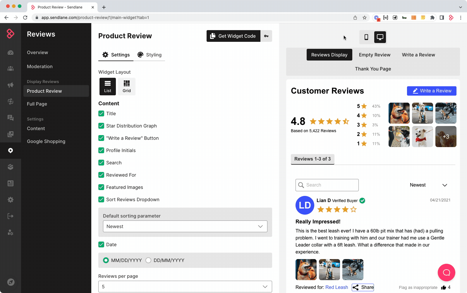
Settings Tab
Use the Settings tab of the Product Review page to determine what information is visible on the product review widget.
Reviews Widget Layout
Select List to show a single column of product reviews, or Grid to show multiple columns of reviews.
List 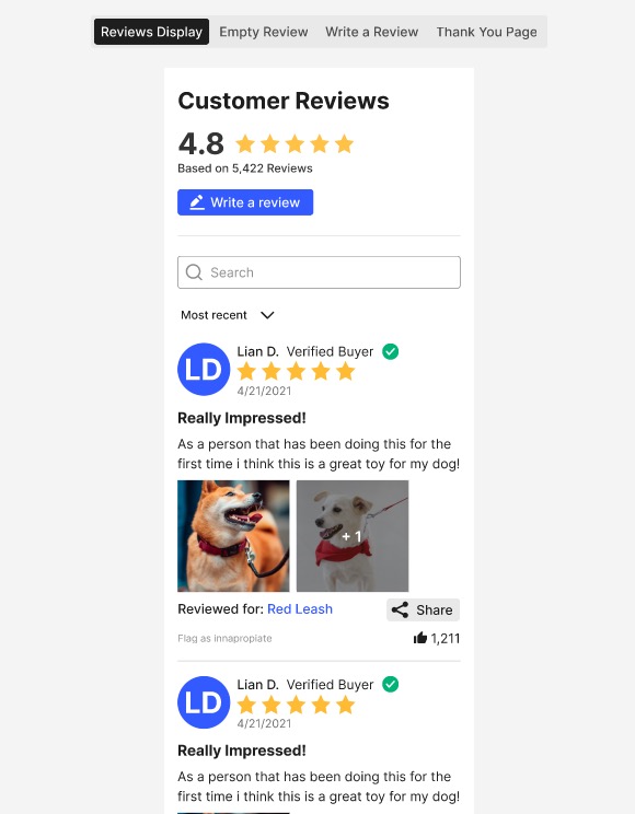 | Grid  |
Content Display Options
Toggle the following pieces of content on or off by checking the checkbox next to each item.
Title - Set a description for your reviews widget, like “Customer Reviews” in the above screenshots
Star Distribution Graph - Displays the percentage of each star rating for the product (grid layout only)
“Write a review” button - Displays a button that leads to a review form (uncheck to prevent unverified reviews)
Profile Initials - Displays the initials of the reviewer (list layout only)
Search - Allows website visitors to search for specific keywords in reviews
Reviewed For - Displays the name of the product variant being reviewed if the product belongs to a product group
Featured images - Displays photos attached to reviews
Sort Reviews Dropdown - Sorts reviews based on the following criteria
Newest
High photos
Highest Rating
Lowest Rating
Date - Change date format
Reviews per page - Set the number of reviews displayed per page
🚨 Saved changes are live immediately
Use each tab of the preview pane to finalize your choices before clicking Save Changes
Styles Tab
Use the Styles tab of the reviews widget to adjust colors, fonts, and more to match your store’s branding.
General Style Options
Background Color - Set the color of the entire widget’s background
Star Color - Set the color of the stars attached to each review, the average product rating, and the star distribution graph
Profile Initials Badge Color - Set the color of the reviewer initials icon
Verified Buyer Badge Color - Make verified reviews (review was submitted from a link in a review request Automation and is associated with a confirmed purchase) stand out with a pop of color that contrasts with the rest of the widget’s styling
Fonts Style Options
Font Family - Set the font family for all text in the reviews widget (custom fonts are not supported)
Font Color - Set the font color for all text in the reviews widget
Hyperlink Color - Set the text color for hyperlinks
Buttons Style Options
Button Color - Set the color of the “Write a review” button
Font Color - Set the font color for text in the “Write a review” button
Font Weight - Set the font weight for the text of all reviews
Reviews Card Styles Options
The Cary Styles section will only appear when widget layout is set to Grid.
Shadow - Select a light, medium, or dark border around each review card. For no shadow, leave Shadow as None.
Corner Radius - Select a corder radius for each review card.
🚨 Saved changes are live immediately
Use each tab of the preview pane to finalize your choices before clicking Save Changes
⏭ Next Steps
If you've already been collecting reviews, check out our guide to importing and exporting reviews to learn how to import existing reviews.
If you don't have existing reviews to import, set up your reviews Automations.